UNO Releases Color Blind Friendly Deck
A press release went out in 2017 saying that the UNO card game is finally available in a colour blind friendly way. How did they address this? They used a language of symbols in place of colours. Let’s take a look.

This immediately strikes me as a tough user experience.
I can see the logic someone went for. Triangle is red. Slash is yellow. Triangle plus slash is orange. But it falls apart when you have to remember which way a triangle is facing to know which colour this is.
With these soft, rounded rectangles, can you tell which way it’s pointing at a distance? Make this small enough or far away enough and it probably looks like an amorphous blob.
Remember this is a game where someone gets to change the colour at some point. They might yell out RED. You will have to consult the legend OR remember which-direction-facing triangle that is.
Based on this legend, there are LOTS of colours you might need to know about. Triangles, slashes, squares grouped in various ways. I often warn that if you go just past critical mass with icons, you are now in hieroglyphics. You have a language people need to remember.
This isn’t totally UNO’s fault.
They are using ColorAdd’s Color Alphabet. Someone else designed this to solve the problem of visually communicating colours to the colour blind. I am not sure this “standard” has ever taken off. I travel a lot and haven’t seen it anywhere. Perhaps because it’s flawed and hard to remember. The ColorAdd website says copyright 2010 so it’s been around a while… yet I have never seen it anywhere before.
The press release says this deck is in partnership with ColorAdd. It also says the decks are “backordered.” Perhaps they are not producing them until they see what the real demand is.
We can’t blame UNO for how this Color Language is designed but we can wag a finger at them for choosing it (or choosing to partner with ColorAdd).
Now look at the size and placement of these hieroglyphics.
This part is also UNO’s fault. Sorry, UNO.

Did you spot it? The little triangle next to the small number on the card? The soft, rounded triangle. UNO cards aren’t that big so this is probably a pretty small icon.
And did you notice that this icon appears right side up at the top and upside down at the bottom (like the number)? That’s especially tough in a symbol language where shapes are mirror images. Red and blue are mirror images. So at a quick glance, what colour is this? Will someone who is also dyslexic also struggle with these symbols?
How else can UNO solve this?
A co-worker sent me this after I opened up a discussion on this deck.

On the left, the most common form of colour blindness. On the right, non colour blind vision. So yes, UNO has a colour blindness problem but how is this best solved?
Two suggestions.
Create their own symbol language. Use a silhouette shape of an animal to represent colours. I’d run tests with kids to see what colours they associate with which animals (and also test colour blind kids). But for fun how about Red Rhino, Yellow Bird, Green Frog, and Blue Butterfly.
Change how they do their character cards. UNO sells many different decks. Here is a pic I found on Google Images of the Disney Princesses deck.
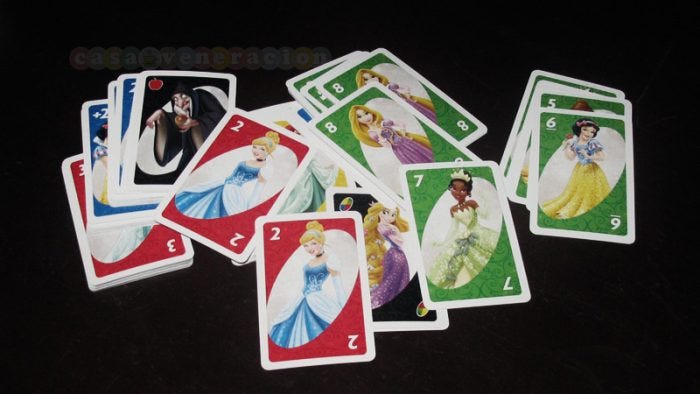
They also have Toy Story, Cars, Hello Kitty, and many others. But take a look at this image. This deck can’t be used by the colour blind because all the green cards don’t have the same princesses on them. They’re not even characters from the same era. I can’t group them in any way. So they need to improve upon that.
Snow White can be yellow, Tiana can be green, Cinderella is blue, and Jasmine can be red. All the green cards would get Tiana, not just some of them. If you’re establishing a code or language, you need that consistency.
At least UNO tried.
You have to give UNO points for trying to come out with something for colour blind people, even after 40ish years. However, they probably have missed the mark by using a probably-unfamiliar, potentially-confusing symbolic language and then printing it small and in various orientations (when orientation matters).
To UNO I say “go fish.”
And ColorAdd
UNO really only needs 4 colours from what I remember. They are obviously plugging ColorAdd by including two cards explaining the colours and how you combine them to make colours.
ColorAdd goes beyond that to try to describe colours further. Here is their “code.”
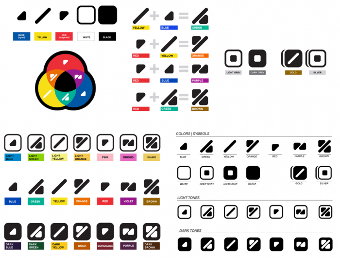
My ongoing thoughts include:
- I still can’t imagine this works at any sort of decent distance (the way it’s intended) including for traffic lights and walk/do not walk signs.
- Is it important to know shades of a colour you can’t see? Would that change safety or an experience to know something is dark red vs red?
- If nearly all colour blindness has to do with red and green, why not work on super clear symbols that cover red and green? Why try to create symbols for a huge palette including gold and silver?
